Measuring Wage Inequality
The table below reports Gini coefficients for male earnings based on the GHS, NES and FES between 1975 and 1996. All earnings are expressed in 1996 prices.
| Year | Weekly wages | Hourly Wages | |||
|---|---|---|---|---|---|
| GHS | NES | FES | NES | FES | |
| 1975 | 0.249 | 0.236 | 0.244 | 0.223 | 0.239 |
| 1976 | 0.242 | 0.239 | 0.240 | 0.229 | 0.235 |
| 1977 | 0.240 | 0.233 | 0.238 | 0.221 | 0.236 |
| 1978 | 0.237 | 0.239 | 0.244 | 0.227 | 0.244 |
| 1979 | 0.231 | 0.245 | 0.246 | 0.228 | 0.240 |
| 1980 | 0.244 | 0.245 | 0.262 | 0.233 | 0.256 |
| 1981 | 0.250 | 0.251 | 0.266 | 0.246 | 0.264 |
| 1982 | 0.277 | 0.254 | 0.260 | 0.248 | 0.258 |
| 1983 | 0.256 | 0.260 | 0.279 | 0.253 | 0.276 |
| 1984 | 0.281 | 0.274 | 0.276 | 0.261 | 0.273 |
| 1985 | 0.283 | 0.275 | 0.292 | 0.261 | 0.285 |
| 1986 | 0.294 | 0.279 | 0.298 | 0.266 | 0.287 |
| 1987 | 0.301 | 0.289 | 0.319 | 0.277 | 0.305 |
| 1988 | 0.298 | 0.295 | 0.311 | 0.284 | 0.299 |
| 1989 | 0.302 | 0.298 | 0.302 | 0.288 | 0.291 |
| 1990 | 0.301 | 0.299 | 0.324 | 0.289 | 0.312 |
| 1991 | 0.313 | 0.303 | 0.321 | 0.294 | 0.301 |
| 1992 | 0.316 | 0.306 | 0.330 | 0.296 | 0.309 |
| 1993 | 0.314 | 0.311 | 0.338 | 0.301 | 0.319 |
| 1994 | 0.324 | 0.316 | 0.338 | 0.308 | 0.320 |
| 1995 | 0.325 | 0.322 | 0.326 | 0.317 | 0.358 |
| 1996 | - | 0.325 | 0.329 | 0.318 | 0.335 |
source (9)
The patterns in the data are very clear. Irrespective of whether one looks at weekly or hourly earnings, there was a slight fall in inequality in the 1970's which continued up to around 1977/78, after which inequality rises. The scales of the 1970's fall (which commentators at the time thought corresponded to a large compression) pales into significance compared to the rises that followed.
From the late 1970's and 1980's inequalities in earnings rose massively. According to the FES, Gini coefficients for male hourly earnings rose from 0.240 in 1979 to 0.312 in 1990, corresponding to a 30 % increase over eleven years. In the 1990s the Gini coefficients seem to show inequality continuing to rise, but at a slower rate. For example,the FES Gini for male hourly wages rises from 0.312 in 1990 to 0.335 by 1996 a rise of just over 7%. In all cases the, the 1979 - 1990 annualised chnage in Gini is higher, usually considerably higher, then the 1990-1996 annualised change.(9)
There are several methods to measuring wage inequality in an income distribution. Most of these measures segment income distribution and look at how much income goes to these different segments. For example in complete income equality:-
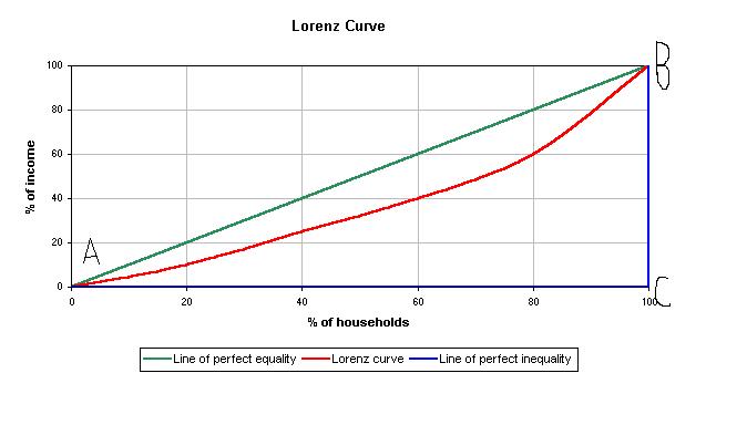
Let's suppose that we rank all household incomes nationally from the highest to the lowest and we then break the population of households into five groups of equal size. Thus, the first quartile contains the twenty percent of households with the lowest incomes and the fifth quartile contains the twenty percent of households with the highest incomes. We can now investigate how much income goes to households in each quartile. In this example of perfect wage equality it will be the case that twenty five percent of the income goes to quartile one, twenty five percent to quartile and so on. Thus the result is line AB below.
The line indicates that 20% of the income goes to the bottom 20% of the households, 40% of the income goes to the bottom 40% of households, 60% of income goes to the bottom 60% of households and so on. This line (AB) is called a Lorenz curve; it reports the income distribution to the various quintiles of households. The "perfect equality" Lorenz curve is always a straight line with a locus of 45 degrees.
The graph below shows the actual distribution of wages in the Unites states as of 2005. We can see that the results of the actual Lorenz curve are not at all close to those of the "perfect-equality Lorenz curve, thus suggesting vast wage inequality. We see that the cumulative share of wages of the bottom 40% is a mere 12%; less than a third of the share they should receive according to the "perfect-equality Lorenz curve. The more wage inequality present the further away the actual Lorenz curve will be from the 45 degree "perfect-equality" Lorenz curve!(5)
| Quintile |
Share of income |
Cumulative share of income |
|---|---|---|
| One |
0.034 |
0.034 |
| Two |
0.086 |
0.120 |
| Three |
0.145 |
0.265 |
| Four |
0.229 |
0.494 |
| Five |
0.505 |
1.000 |
Reference: (5)
From plotting the "perfect-equality" Lorenz curve against the actual Lorenz curve we can calculate the Gini coefficient. The ratio of the shaded area to the area in the triangle ABC gives the Gini coefficient. The Gini-coefficient is defined as:
Gini coefficient = Area between perfect-equality Lorenz curve and actual Lorenz curve/Area under
Perfect-equality Lorenz curve.
By definition the Gini coefficient would be equal to zero when the actual distribution of income demonstrates perfect equality (I.E when the income goes equally between all quartiles). The Gino coefficient would equal 1 when the distribution demonstrates perfect inequality (I.E when all income goes to the highest quartile).
In relation to the diagram above the gini coefficient is calculated from the ratio of the shaded area to the triangle given by ABC. Thus in the U.S in 2006, the gini coefficient for household income was 0.43.
Criticisms of Gini coefficient:-
*Factors are overlooked by summarising the entire shape of the income distribution into a single number. This is flawed because for example a shift in income from the bottom quintile to the top quintile will have the same effect on the gini coefficient as a shift in income from the third quintile to the top quintile, despite the two distributions not being the same.
* As a result of these criticisms, a lot of studies use additional measures of inequality. The most common alternative methods include the 90-10 wage gap and the 50-10 wage gap. The 90-10 wage gap presents the wage differential between a worker in the 90th percentile of income distribution and a worker in the 10th percentile. Similarly, the 50-10 wage gap gives the percent differential between a worker in the 50thpercentile and a worker at the 10th percentile. The 90-10 wage gap method presents inequality between top earners and low-income earners. Whilst, the 50-10 wage gap method presents a measure of inequality between middle class and low income earners. (All Borjas - graph to put in, one on the gini coefficient and Lorenz curve.)
Percentile ratios
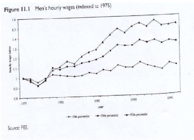
Referring back to the Machin example mentioned at the head of the page, labour economists often use Percentile ratios in order to identify the shifts behind the overall change.
Consider the ratio of the earnings of the 90th percentile (the person in each year who is 10 per cent from the top of the earnings distribution) relative to the 10th percentile (the person 10 per cent form the bottom of the distribution). The 90-10 ratios given in the table above show much the same pattern as the Gini's in the table at the head of the page. Wage inequality for men rises sharply from the late 1970's to the late 1980s/early 1990's., but slows down in the 1990s. The ratios describing the revolution of the lower end od teh distribution (the middle relative to the bottom 10 per cent - the 50-10 ratio) and the upper end (the 90-50 ratio) demonstrate that the 1980s rise in wage inequality was characterised by an opening out at both ends of the distribution with the highest earners doing much better than those in the middle, but in turn the middle doing so much better than the bottom.(9)
The graph below plots the evolution of the 10th, 50th and 90th percentiles of the male distribution over time
source(32) (9)